こんにちは、もがちゃんです。
前回、要素を横並びにする時に使えるスタイルとして display:inline-block を紹介しましたが、今回はもっと使いやすいスタイルを紹介します。
今回紹介するスタイルは、tableタグを使用した時と同じような表現が可能になるスタイル(display:tableとdisplay:table-cell)です。
目次
display:tableとdisplay:table-cellの使用例
比較するためtableタグを使用した例とdisplay:tableとdisplay:table-cellを使用した例を紹介します。
tableタグ使用の例
tableタグ使用の例
<html>
<head>
<title>tableタグ使用の例</title>
</head>
<body>
<table border="1">
<tr>
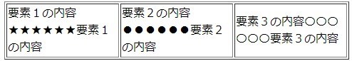
<td>要素1の内容★★★★★★要素1の内容</td>
<td>要素2の内容●●●●●●要素2の内容</td>
<td>要素3の内容〇〇〇〇〇〇要素3の内容</td>
</tr>
</tabl>
</body>
</html>
display:tableとdisplay:table-cell使用の例
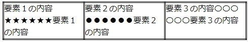
display:tableとdisplay:table-cell使用の例
<html>
    <head>
        <title>display:table display:table-cellスタイル使用の例</title>
        <style>
            .table {
                display: table;
                border: double;
                border-collapse: collapse;
            }
            .table-cell {
                display: table-cell;
                border: double;
            }
        </style>
    </head>
    <body>
        <div class="table">
           <div class="table-cell">要素1の内容★★★★★★要素1の内容</div>
           <div class="table-cell">要素2の内容●●●●●●要素2の内容</div>
           <div class="table-cell">要素3の内容〇〇〇〇〇〇要素3の内容</div>
        </div>
    </body>
</html>
display:tableとdisplay:table-cellの使用方
- display:tableの指定は、display:table-cellを指定する要素の親要素に指定する。(tableタグ使用時のtable相当要素)
- display:table-cellの指定は、横並びにしたい要素に指定する。(tableタグ使用時のtd相当要素)
display:table-cell以外の関連スタイル
- display:table-row-group(tbody要素のような表示となる)
- display:table-header-group(thead要素のような表示となる)
- display:table-row(tr要素のような表示となる)
使用例
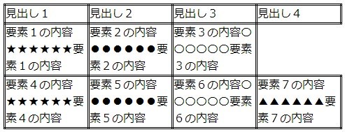
table関連スタイルの使用例
<html>
    <head>
        <title>display:table display:table-cellスタイル使用の例</title>
        <style>
            .table {
                display: table;
                border: double;
                border-collapse: collapse;
            }
            .table-row-group {
                display: table-row-group;
            }
            .table-header-group {
                display: table-header-group;
            }
            .table-row {
                display: table-row;
            }
            .table-cell {
                display: table-cell;
                border: double;
            }
        </style>
    </head>
    <body>
        <div class="table">
           <div class="table-row-group">
               <div class="table-row">
                   <div class="table-cell">要素1の内容★★★★★★要素1の内容</div>
                   <div class="table-cell">要素2の内容●●●●●●要素2の内容</div>
                   <div class="table-cell">要素3の内容〇〇〇〇〇〇要素3の内容</div>
               </div>
               <div class="table-row">
                   <div class="table-cell">要素4の内容★★★★★★要素4の内容</div>
                   <div class="table-cell">要素5の内容●●●●●●要素5の内容</div>
                   <div class="table-cell">要素6の内容〇〇〇〇〇〇要素6の内容</div>
                   <div class="table-cell">要素7の内容▲▲▲▲▲▲要素7の内容</div>
               </div>
           </div>
           <div class="table-header-group">
               <div class="table-cell">見出し1</div>
               <div class="table-cell">見出し2</div>
               <div class="table-cell">見出し3</div>
               <div class="table-cell">見出し4</div>
           </div>
        </div>
    </body>
</html>
見出し部分の記述が要素部分の後ろに来ても見出しとして表示されますね。また、行毎に要素数が違っても崩れたりしないで表示されます。
要素を横並びにするには(table,table-cell)まとめ
table関連スタイルは、tableタグを使用した時を同じような表示になるのでレイアウトを容易にイメージすることが出来ます。
この部分は、display:inline-blockで要素の横並びを実現するより利用しやすいです。
まぁ、単純にtableタグを使えば良いのでしょうが、どうしてもtableタグが使えないとか使いたくないという場合に使える方法なので、この方法も知っておくと良いですね。